Features
A guided tour of everything the gallery gives you once it's installed. Every section answers two questions: what does it do and why does it matter. If you only have two minutes, skim the screenshots.
TL;DR — annotate your Cotton components once with
@propcomments, and the gallery becomes your live playground, your design QA tool, your documentation, and your refactor planner — without leaving Django.
Browse — the index page
See your whole component catalog in one screen.
Components are auto-discovered from your cotton/ folder, grouped by
category (atoms, molecules, organisms…), and each card shows a
live thumbnail rendered from the actual template. Dependency badges
in the hero auto-detect Tailwind, HTMX, Alpine, Leaflet and more from
the URLs you inject.
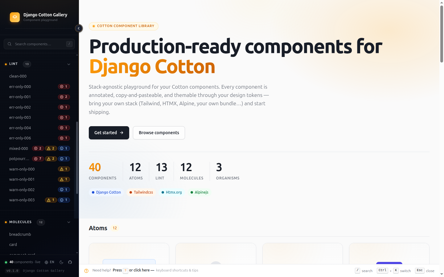
Where: /django-cotton-gallery/ — the root URL of the gallery.
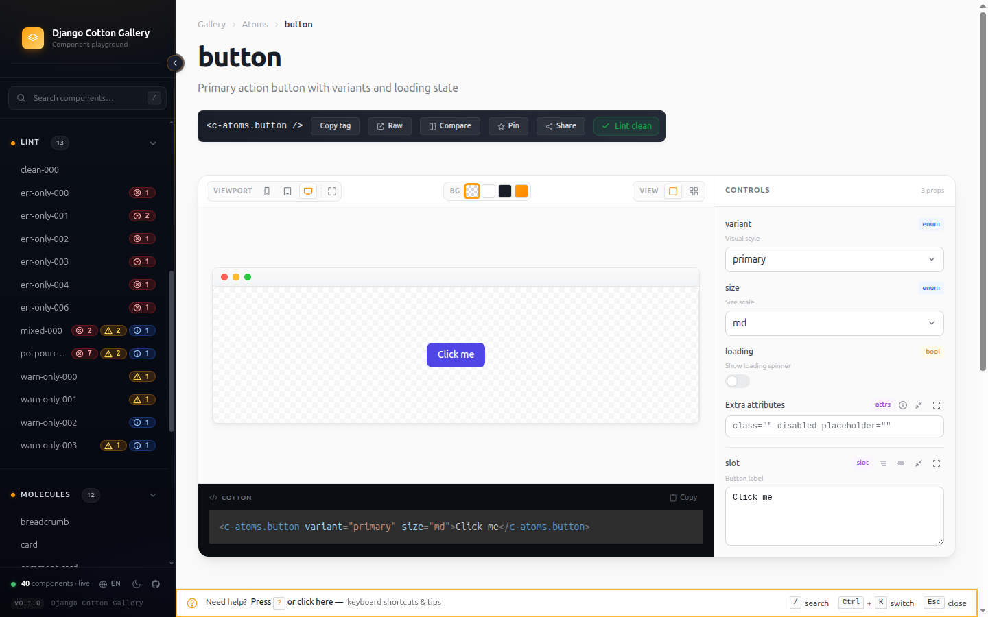
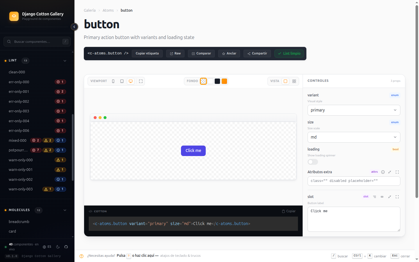
Detail page — live preview with auto-generated controls
Tweak any prop in real time without touching code.
Every @prop variant:select['primary','secondary'] annotation becomes a
matching dropdown in the controls panel. Booleans become toggles,
numbers become inputs, slots become editors. The preview re-renders on
every change. Copy the <c-tag /> line, the source, or jump into the
raw view — all from the same page.
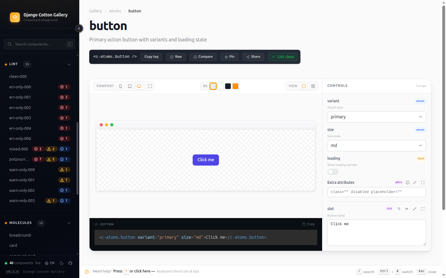
Where: Click any card on the index, or jump via the switcher.
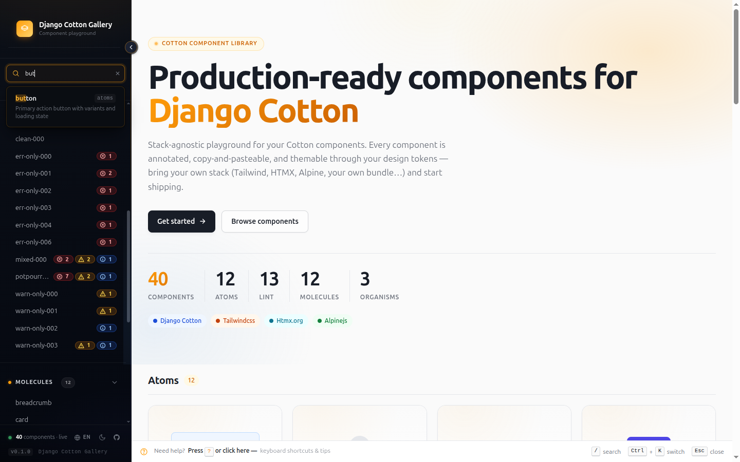
Quick switcher — Ctrl+K from anywhere
Fuzzy-find any component or filter by what it accepts.
Press Ctrl+K (or Cmd+K on Mac) anywhere in the gallery. Type a name,
or use structured filters to narrow by capability:
| Filter | What it finds |
|---|---|
prop:size |
Components that declare a size prop |
prop:variant=primary |
Components whose variant accepts primary |
slot:actions |
Components with a named slot called actions |
accepts-attrs |
Components that pass {{ attrs }} through |
has-named-slots |
Components with at least one named slot |
has-default-slot |
Components that render {{ slot }} |
deprecated |
Components marked @deprecated |
Combine filters with spaces. The autocompleter suggests prop names and values as you type.
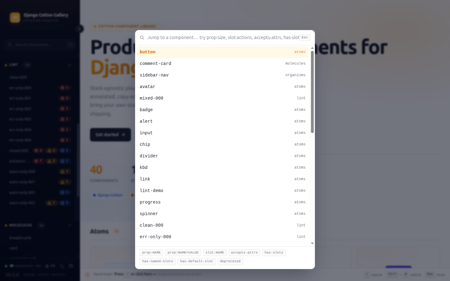
Where: Ctrl+K from any page in the gallery.
Sidebar — pinning, recents, lint badges
Your working set always one click away.
- Pin frequent components with the star icon — they stick to the top of the sidebar across navigations.
- Recents auto-tracks your last visited components.
- Lint badges (red / amber / blue dots) appear next to each component link so you see hygiene at a glance, without opening the Lint report.
- Filter buttons at the top let you narrow the sidebar to only pinned or only recent components when the catalog gets big.
The sidebar collapses on narrow viewports and can be hidden entirely with the toggle at the bottom.
Lint report — catch broken @prop contracts
Find documentation drift before users hit it.
The linter cross-checks every component's @prop annotations against
its actual <c-vars> declaration. It catches:
default-mismatch— prop default disagrees with<c-vars>valueorphan-annotation—@propdeclared but missing from<c-vars>(the prop never reaches the template)missing-cvars—@propannotations but no<c-vars>tag at all (Cotton passes nothing to the template)enum-default-out-of-range— default isn't in the declared optionstype-default-mismatch— boolean default like"maybe", number default like"abc"required-with-default—| requiredtogether with| default:(Cotton silently dropsrequired)missing-description—@propwithout a| description:filtermissing-annotation—<c-vars>attribute with no@propto document it (Stub copy button gives you a ready-to-paste fix)dynamic-prefix-mismatch—:propon one side, plain on the otherundeclared-template-var— heuristic hint for{{ x }}references not in<c-vars>(ignore if it comes from a context processor)
Filter by severity (errors / warnings / hints), search by component or rule, and copy stubs straight from the report.
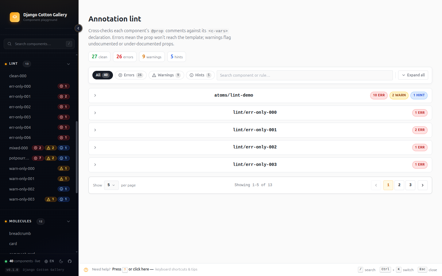
Where: /django-cotton-gallery/lint/ or the Lint entry in the sidebar menu.
Insights dashboard — catalog hygiene at a glance
Find what's rotting in your component library.
A dashboard with the metrics you actually need to maintain a component library:
- Health score (0-100) based on lint severity weights
- Annotation coverage — % of components fully documented
- Zombies — components that nothing else references (candidates for
deletion). Requires
DJANGO_COTTON_GALLERY_SCAN_EXTERNAL_USERS=True. - Most referenced — your real-life most-used components
- Deprecated — components carrying
@deprecatedmarkers
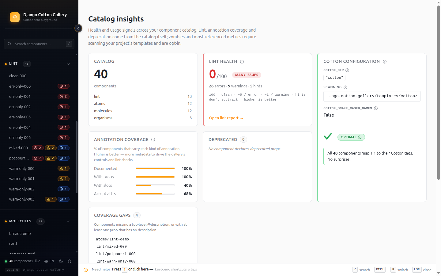
Where: /django-cotton-gallery/insights/ or the sidebar menu.
Compare view — side-by-side rendering
Verify visual consistency between similar variants.
Pick any two components and render them side-by-side. Useful for
spotting drift between sibling components (e.g. button vs
button-icon) or comparing two states of the same component before
merging.
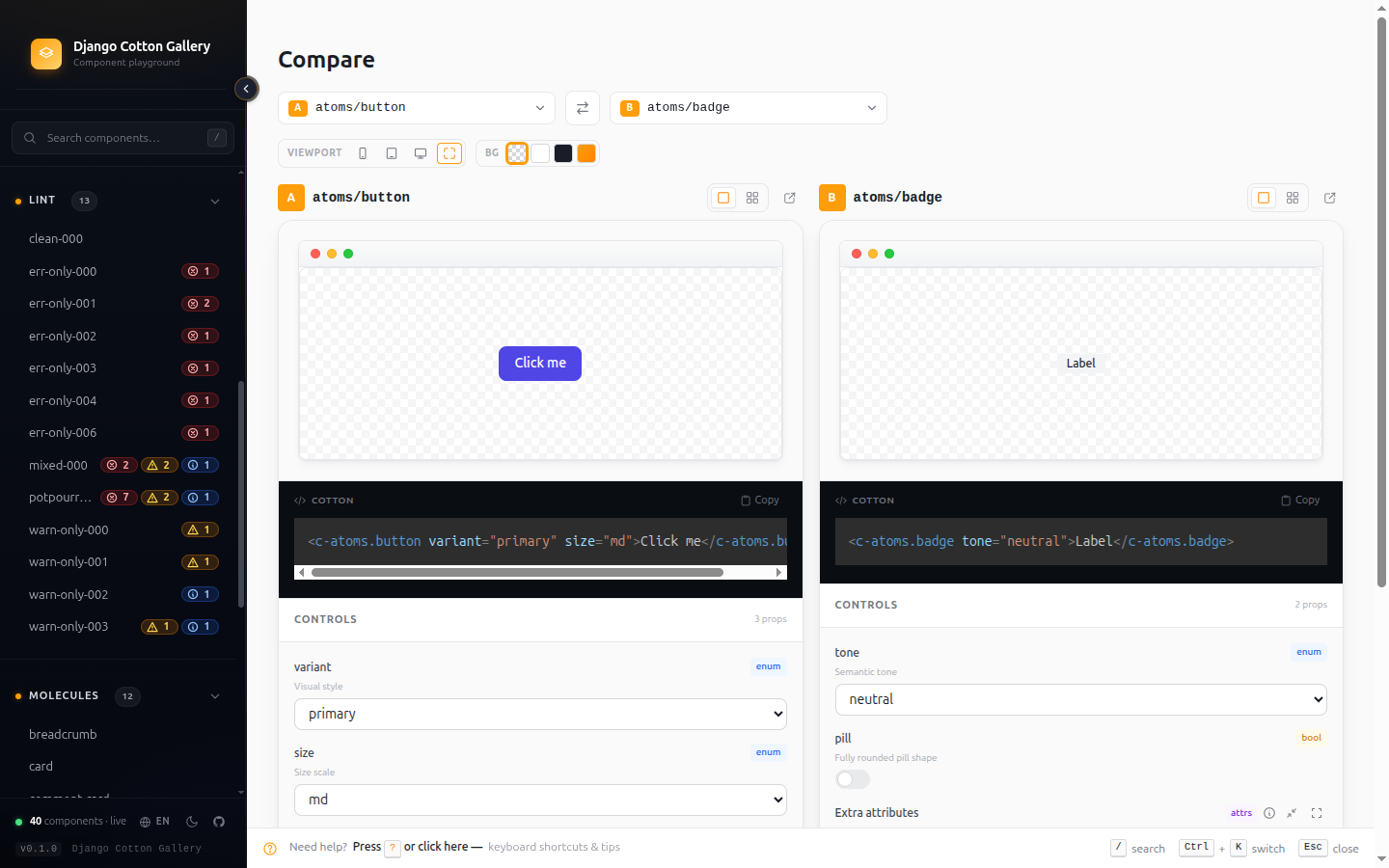
Where: /django-cotton-gallery/compare/ or the sidebar menu. The Pin
button on a detail page also sends one component to Compare.
Transitive dependency tree
Plan refactors safely — see the full impact chain.
Each detail page has a Deps tab that shows:
- Uses — every component this one references (direct + transitive)
- Used by — every component that references this one (direct + transitive)
- External usage — non-Cotton templates that include this
component, when
DJANGO_COTTON_GALLERY_SCAN_EXTERNAL_USERS=True
The tree is cycle-aware and depth-capped, so even circular catalogs render without exploding.
Annotation builder — write @prop interactively
Skip the syntax memorisation.
A form-based editor for crafting @prop annotations: pick a type,
fill in defaults, options, descriptions, and the matching <c-vars>
line is generated for you. Copy and paste into a new component file —
the gallery picks it up on next refresh.
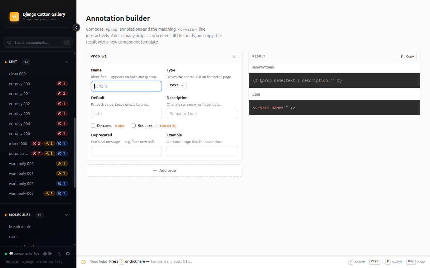
Where: /django-cotton-gallery/builder/ or the sidebar menu.
In-app docs — the full reference, without leaving the gallery
Every setting, annotation rule and playground trick on one page.
The gallery ships its own reference page so you never have to context-switch
to a browser tab to remember a setting name or the @prop grammar. It mirrors
this site's Configuration and Annotation
reference, rendered inside the gallery and translated into
your language. Three areas, each with an "On this page" jump list:
- Configuration — component paths, catalog ordering & filtering, asset
injection (external URLs and inline partials), the language switcher, and
lint-in-CI, with a working
settings.pyexample. - Annotations — anatomy of a
@prop, prop types, filters, dynamic (:) props, and slots & triggers. - Playground features — the variants matrix, shareable URL state,
pass-through
attrscontrol, sidebar typeahead, live syntax highlighting, CSS autocomplete insidestyleattributes, and the maximize-editor modal.
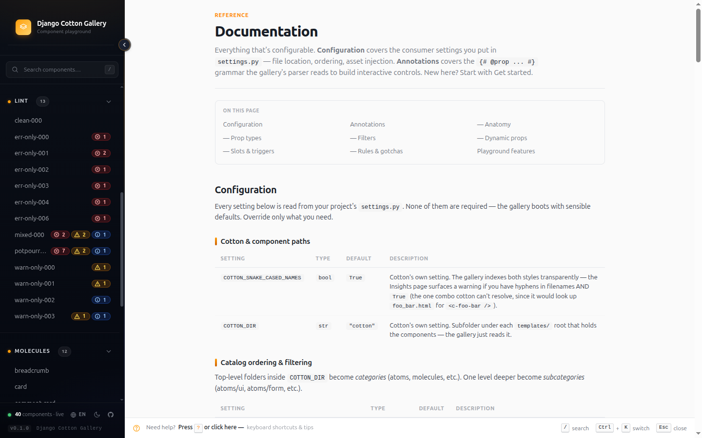
Where: /django-cotton-gallery/docs/ or the sidebar menu.
Raw view — your component, no gallery in the way
A debugging surface and a validation tool — not just a screenshot helper.
Each component has a /raw/ URL that renders ONLY the component, with
zero gallery chrome (no sidebar, no nav, no controls). Two reasons it
matters:
1. Validate that the gallery itself isn't the problem.
If a component looks broken inside the gallery, hit /raw/ to see it
isolated. If it still looks broken, the bug is in your component or
your assets. If it suddenly works, the bug is in the gallery's
chrome interaction — open an issue.
2. Override the template for full control of the preview environment.
Drop your own templates/django_cotton_gallery/raw.html in your
project's templates directory and Django's loader will use yours
instead of the library's. Add whatever you need — extra CDNs, custom
viewport, a debug HUD, design-system bootstrap scripts — as long as
you keep the rendered component slot:
<!DOCTYPE html>
<html>
<head>
  <!-- ...your full asset stack... -->
</head>
<body>
  {{ component_html|safe }}   {# ← the only required line #}
</body>
</html>
For most cases you don't need to override anything: the default
raw.html already loads DJANGO_COTTON_GALLERY_EXTRA_CSS /
DJANGO_COTTON_GALLERY_EXTRA_JS and the _extra_head.html /
_extra_body.html partials. Whatever you wired into your project (Tailwind,
HTMX, Alpine, your own bundle) flows through and renders around the
component. Override is for the cases those don't cover.
Where: From any detail page, click the "Raw" button. Or visit
/django-cotton-gallery/<path-to-component>/raw/ directly.
Tip: also iframe-friendly — embed the /raw/ URL in design tools,
Notion, or your own internal docs to surface live components outside
the gallery.
i18n — gallery chrome in your language
Built-in support for English, Spanish, Basque, French.
Every label, tooltip, error message and lint description is translated.
The gallery respects the user's Accept-Language header and offers a
manual switcher in the sidebar footer. Adding a new language is a
matter of dropping a .po file in locale/<lang>/LC_MESSAGES/.
cotton_lint — the same checks in your CI
Fail builds that ship broken @prop annotations.
The same lint engine that powers the web report ships as a Django management command:
python manage.py cotton_lint
# Exit 0 — clean
# Exit 1 — errors found

python manage.py cotton_lint --warnings-as-errors
# Exit 1 — warnings escalate to errors (CI-strict mode)
Add it to a pre-commit hook or a GitHub Actions job and your team
can't merge a PR with a default-mismatch or orphan-annotation.
Asset injection — bring your own stack
The gallery renders YOUR components with YOUR styles.
Two complementary mechanisms:
DJANGO_COTTON_GALLERY_EXTRA_CSS/DJANGO_COTTON_GALLERY_EXTRA_JSinsettings.py— for plain URL lists. The detector parses these to populate the dependency badges in the hero.templates/django_cotton_gallery/_extra_head.htmland_extra_body.html— drop these files in your project's template directory for inline HTML (Tailwind config, env keys, design tokens). Auto-detected, no settings change needed.
See the Configuration page for the full setup.
What's NOT here on purpose
A short list of things we don't try to do, by design:
- No visual regression — that's a separate problem (Chromatic,
Playwright). Use the
/raw/view to feed those tools. - No production exposure — the gallery never mounts itself or reads
DEBUG; you wire its URLs, and it warns loudly whenever they're detected so you don't ship it by accident. It's a dev tool. - No offline mode — it's served by your Django dev server, no service worker.
Next steps
- New here? Get started in under a minute.
- Want to fine-tune? Configuration reference.
- Writing components? Annotation reference.